Photo Archive Critique - Angel's Share - April 22, 2015.
Memories.
That’s who we really are, right?
What would we be without memories?
Apple likes to play up that nostalgia in the Photos app by creating little memory collections. A recent one popped up with these photos of a trip to Angel’s Share that I took on April 22nd, 2015.
It’s pretty likely, given this visit and subsequent munches at Village Yokocho (which I’ll show you in the next post), that I was out with my old partner in debauchery, Sonny Seng, for this occasion. - I just checked, and he and I also did an east village cocktail crawl just a few days prior, on April 14th, 2015. I discovered the images for that were mysteriously absent from Photos, so that’s been corrected, and I’ll share those with you in the future.
Let’s talk about one of the ingredients of a great photography - love for the subject.
I love craft cocktails - they’re often mysterious, complex, and rich with a history and origin story.
My affection began in college when a friend of mind who really enjoyed a tipple lead me down the path and helped me stock up a home bar. We started off with intensely sugary drinks (have you ever had a Rusty Nail? It’s Drambuie and Scotch. Drambuie is SO SWEET. YUCK. I can’t imagine drinking it now. I gag just thinking about it), which unsurprisingly was also how I eased my way into enjoying coffee.
As I got older or just had more experience with both of these flavorful liquids, I began to appreciate the complex flavors beneath all the sugar, so now I tend to like my drinks fairly dry instead of painfully sweet, and I like my coffee pure black - so I can get the essence of the drink and appreciate all the care and attention that when into its production.
I began to appreciate the story and history that get wrapped up in craft cocktails and the storied bottles they come from, and that love and fascination make them a great subject for me - I already care about and understand my subject, and that helps me know what I want to convey with my images, and to anticipate what’s going to happen next, because I’m deeply familiar with this process - again, because I have experience with the subject and with photographing it.
By this point, I’d been taking pictures of food for years, since it was the subject that originally sparked my interest in photography. But it wasn't only recently that I had transitioned to being a professional photographer, and brought along all that intention when it came to making images.
I made the best images I knew how at the time, always pushing myself to the limit of my knowledge and ability. It’s been several years now, and I can look back on this work and be proud of it, but I can also see some areas for improvement, and I’d like to point those out to you for your benefit.
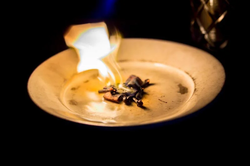
Fire is always a fun subject, given our deep historic connection to it. I’m glad I kept this image dark, preserving the moody feel of the speakeasy. Smokey cocktails were still a rarity at the time, and this was the first time I’d seen someone blowtorch some spices and then invert a glass on it. It was quite the spectacle.
How could this be improved? I think I crushed the highlights a little too much in the edit - I don’t like that the white of the flame is a little dull and grey. Killing the highlights is a pretty common mistake for beginners, and I made it plenty in my early career.
This photo conveys what’s happening - the finished cocktail being strained into the smoke filled glass - but it’s not as obvious and dramatic as I would like. It’s teaming with grain and noise thanks to me really pumping the ISO on a camera not built for low light performance. If I were taking this picture now, I would really prefer to use a flash behind or to the side of the glass to capture all the smoke. If I couldn’t use the flash, I’d try to put some light source in the room behind the glass by changing my perspective. It’s also a little tight on the composition. These days I like a little more environment and breathing room.
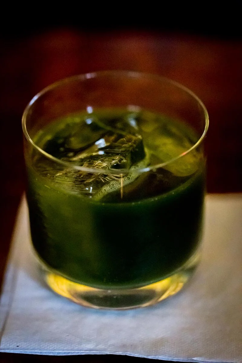
I enjoy a low-key photo, but this feels more dim than it should be. It feels a little dim and muddy, and the sliver of focus on the ice cube and bubbles isn’t really apparent enough, so the image basically looks out of focus. Not a winner all around.
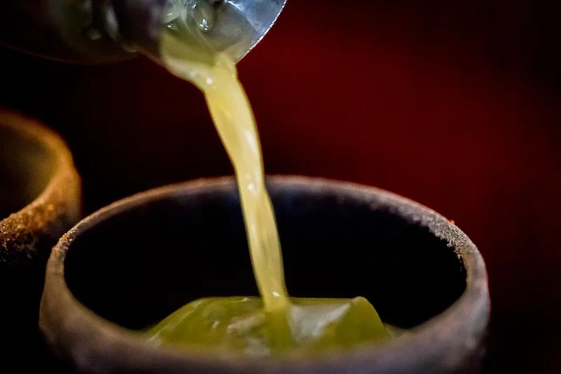
Another shot where the composition is just too tight. It’s focused on the pouring action, so that’s good, but too much of the subject is on the very edge of the frame - both the cup and the shaker. A good rule-of-thumb in photography is to keep your subject away from the very edges of the frame unless you’re going for some intentional disharmony.
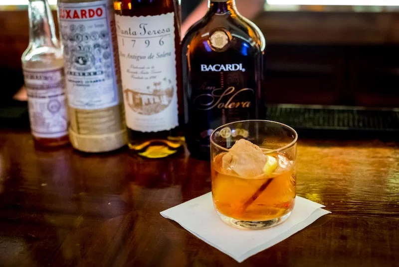
This one’s not bad, but would be improved if there was more separation between the glass and the bottles behind it so that you’d be able to more easily focus on the glass.
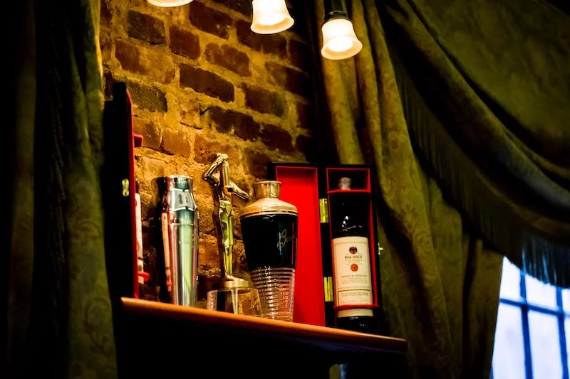
It’s important to work in a little atmosphere, because no bar is just the drinks - a huge aspect of why you visit one place over another is the atmosphere and ambiance. This picture tells the story of the window in the foreground, the pretty flowering tree in the midground, and the background of buildings across the street. You understand it’s the view you’ll see out the window when you’re here. But, the composition could be better. There’s an opportunity to artfully overlay the grid of the foreground window over the windows of the building in the back, and a few minutes spent perfecting that compostion
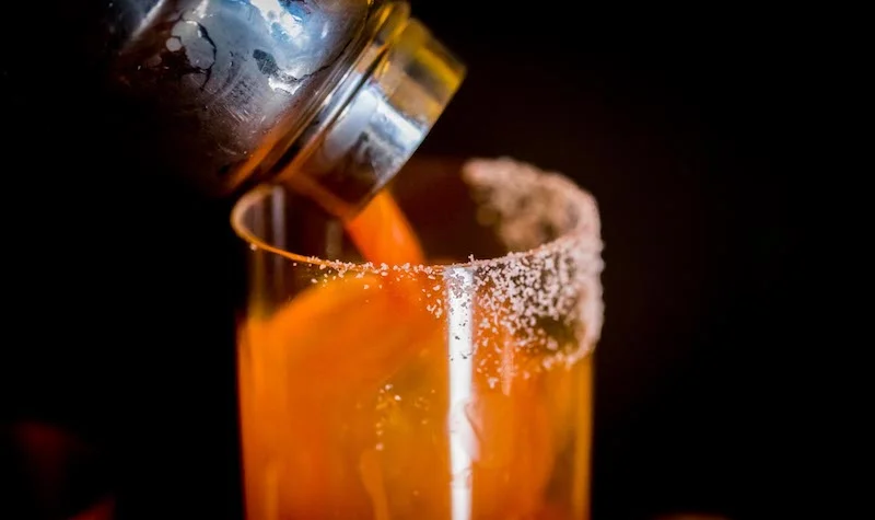


Here’s a nice little collection of images of a vibrant orange drink. Probably had carrot juice in it (hey, it was a long time ago). All of these suffer from the same problem that plagues the rest of the set - claustrophobic composition. The final image with the copper cup is slightly better in this regard. You could call this the “learning to use a macro lens” phase. The problem is that this distance is kind of in between where a lens like this shines - it should either be closer and really focused on a single tiny element, or further away and just using its long focal length to make a well compressed shot.
This photo has some nice things going for it - the blurry second drink in the foreground, a somewhat wider composition than the previous images, and a good range of colors. Some people like the diagonal horizon, feeling that it adds action and tension to the image. I don’t. It could work for a stylized image if that’s intentionally what you’re going for, or say, you’re taking a picture of a dirt bike doing a rad launch, but that’s not what I’m after in my imagery. Given my overlap into the discipline of architectural photography, I prefer a more clean, crisp, minimal vibe in my images. So I make sure never to have angled horizons in my imagery these days. But that, of course, is and element of the style I’ve developed, and not necessarily a hard photographic rule.
Hey look, I took this with my iPhone 4! No, I didn’t. I took it with a DSLR, I was just pushing it too hard in the darkness and didn’t even hit the focus. Is it a terrible image? Not necessarily. You can tell what the subject is and you can tell what’s going on, but that’s not good enough for me. I want a more clean and crisp image now, and wouldn’t be satisfied with this. It could be so much better.
This image is fine, but would benefit from a little more space on the top and bottom. So a step or two back would be in order. But also, I probably wouldn’t shoot this image today - I’d instead go for a straight-on, one-point-perspective, again going back to the more architectural imagery approach I’ve adopted.
Here’s the brightest image in the whole set, and I still like this one. It’s wide enough that you get a sense of place and environment, it tells a story of the man behind the bar, working on preparing this drink, the order for which he’s got just off to the side. You can just see his face at the top of the frame, so you can see a little peek of him without it being distracted. The colors and light could be managed a little better in post, but out of this set this is one of my favorites.
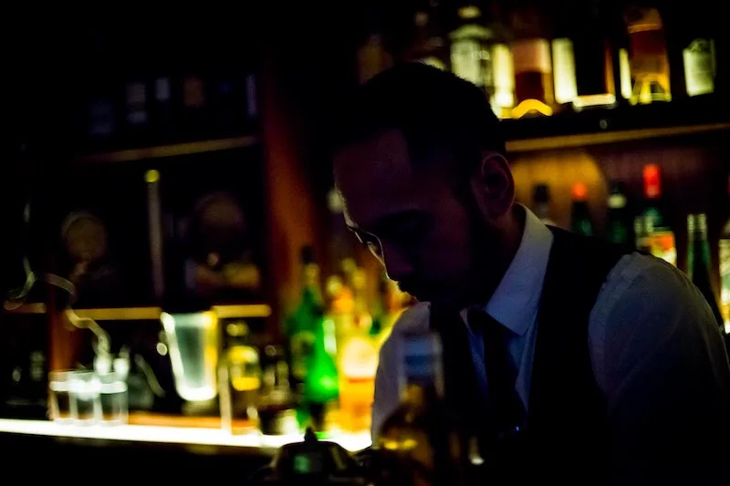
Here’s another favorite from this set. It’s dark and low key, but you can still make a bit of detail in Ben’s face and clothing. It captures the mood and ambience of the speakeasy.
The only photo in this set where you get a good look at his face. There’s a lot of wasted space at the top of the frame that isn’t really adding anything to the image. It would be better if I’d shot it landscape, so that he could be looking deep into the frame.
Here’s a fun one where you get to see a smile on his face, as well as the ingredients of the cocktail he’s building in the foreground. I don’t know if they set the bottles out for many of the customers, but he knows how interested I am in what goes into the drink, so he often does this for me. I like all of the elements of this image, but they’re not layered quite as well as they could be - it would be better if there were a clearer view of the cocktail he’s making, since that’s where this whole story is going. This could be accomplished either by my moving to a different vantage point, or by shuffling the bottles around.
Here’s the finished cocktail from the previous shot. I like the angle on the drink here, looking slightly down into the glass and also seeing through it. Light and colors are still a little muddy, as has plagued most of the images in this series, but again, this camera wasn’t built to be a champ in the dark. Or maybe I just didn’t know how to use it well enough back then. There’s a good compositional line here, in that your eye enters the image at the top right and then roams across the bottles and down to the cocktail. And, if your eye enters the frame from anywhere else, it will drift straight to the cocktail thanks to its dominant color. It’s got the guts of a great image and a little refining on structure and light could make it better. It’s also always nice to get rid of or hide those rubber bar things. They’re very practical, but I never like seeing them in photos. But that’s a luxury you’re probably not going to get unless you’re doing an official shoot for them, or unless you’re very persuasive.
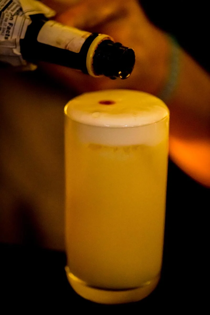
Almost good, but the bright light on the left is the most eye catching thing in the image, and pulls the eye away from the cocktail. You know the cocktail is the focus, and you want to look at it and appreciate it, but that bright light just keeps yanking you away. Be careful about what you let be the brightest object in the image, because that is what the viewer is going to see more than anything else.
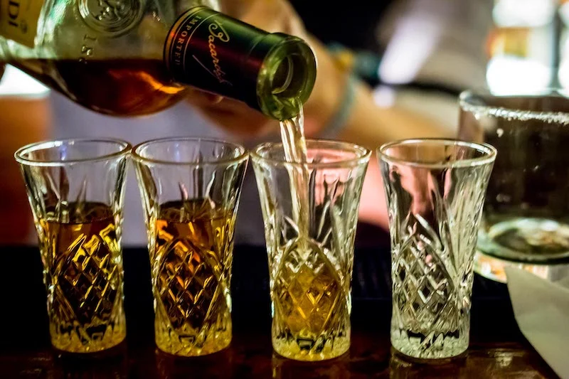
Many a good sipping session ends with a shot shared between the bartender and the patrons. My love affair with rum was picking up, so that’s what we had. I enjoy this pouring shot where some of the glasses are filled but not yet all of them - it gives you a clear sense of what’s happening. Odd numbers are often stronger than even, so I could have tried to compose this so you didn’t see the fourth glass, but that would be slightly dishonest about the real story - that four people were going to be drinking. There’s always a choice to be made between an artistic image and an honest, storytelling image. I also like that you can see the label on the bottle, and I’m sure Bacardi would like that, too. How could the image be improved? That napkin and empty glass on the right aren’t adding anything, so they could be moved for cropped out. And as with every other image here, I could have moved a little further away or use a slightly wider lens for a less cramped composition. And if I were taking this photo today, I would very intentionally line up the glasses in a perfectly straight line.
One thing that comes from experience is a willingness to get more involved in the image. This was fairly early in my career, so I mostly sat back and took the pictures photo journalistically. Also, I was just here having drinks, not on an assignment. But these days, even if I’m just traveling or out having fun, if I see a photo I want, I’m doing to reach out and fiddle with whatever I need to in order to get the photo I want. I build the image I see as I see it in my mind, because that’s how I share my vision of the world with my viewers.
Do this.
I encourage you to take this approach with your own pictures, no matter what skill level you’re at. Look back at pictures from a week ago, a year ago, 5 years ago, and ask yourself what you were doing then, and what you can do better now, and the photos you take today and tomorrow will be better for it.
Props to Ben
Quick shoutout to Ben Rojo for making some of the most fabulous drinks around. When he sees these old pictures of himself he’ll probably respond as many do when looking at old pictures of themselves: “hey, delete those!”
If you read my previous post on the power of repetition and prolific production, then you know the best thing you can do is go out and put some of the stuff you learned here to use. Send me some pictures you took using the lessons you learned from this.

