
Willoughby House - Case Study
Willougby House - A case study on one of my earliest interior design photography sessions.
Harley came to me and said he wanted pictures of the house, mostly for himself and to show off to his family and friends because he was proud of it. He could also have submitted in to design blogs or rented it out, but I’m pretty sure that it was mostly for his own personal use because he was proud of what he’d made. I could say that a private homeowner wanted images of the house to document the work that had gone into the restoration. There we go.
When I first met homeowner Harley Courts he had just bought a run down house in Ridgewod and was in the process of restoring it. He got a great deal on it because of the state of disrepair. If I recall correctly, the old electrical wiring scared people off, but it was something he knew how to fix fairly easily, so he bought the place and set about fixing it up.
As the project came along, he asked me to take some photos of it to showcase the work he had put into transforming it. This was January of 2016, still in the early days of my photographing interiors. It was a very laid back shoot just to document what the space was like at the time. I was photographing mainly real estate then so I had a tendency to shoot very wide images. I’m a little horrified by them now, as any good photographer should be of their old work.
The house receives an abundance of natural light, I didn’t use a flash or even a tripod, these are all just single exposures that I took while walking around the house.


Above: Early photos of Harley's house from January 2016
Over time I learned how to create better images by following a process of:
- seeking out intentional compositions
- staging (moving furniture and objects in the scene)
- merging ambient exposures (putting bright and dark photos together)
- adding light from a flash or torch, often referred to as ‘light painting’
Where the first shoot of this house in 2016 had me just wandering around and snapping whatever appealed to me, I approached it with much more intention for this second shoot in March 2017. Harley cleaned the house throughly before I came, and once I was there we set about staging the house even further. We made slight adjustments to furniture placements, hid nicknacks and electronics, and removed as much clutter as possible.

This image of the living room is my favorite from the whole set. I placed the camera on a tripod behind the couch and set up this one point perspective image of the living room. As I mentioned before, we cleared off some electronics like cables boxes and and the like. We unplugged the TV and tucked the cables away behind the TV itself so they wouldn’t have to be photoshopped out later. It’s always best to do your cleanup in real life. It’s much easier and faster. I’m pretty sure there was another guitar in this room that I removed from the image. We played the magazines out on the coffee table to break it up. We also gave all the pillows in the scene the good ol’ stylist karate chop. Toward the end of the setup, the dog came and curled up on the rug, which was too cute to interrupt. It might have been better for the dog to be somewhere else, since he’s cut off in the middle by the table, but I didn’t want to move her. I wasn’t sure I’d be able to get her settle in somewhere else if I did. Granted, in hindsight I should have moved her after I got the shots, but at the time I didn’t know this was going to be one of my favorite photos. The composition works so well because it gives the sense of exactly what it would be like to sit on the couch and take in the room.
I shot a series of images from a dark one that preserved all the details in the bright window light on the floor up to some very bright images to fill the room with light. I merged them together in photoshop to create this nice, even ambient exposure without going too far. The tendency with real estate photography is to pump up the brightness to much, but when it comes to making really pleasing images a more natural level of light and shadow appeals to our eyes.
Moving on to the rest of the house, images were made in much the same way:
- Find a good composition
- Stage for the camera position
- Take few bracketed images that I would later combine in post.
Looking back on these now, seven years later with significantly more experience, I can see a ton of room for improvement that I can now share with you to help accelerate your own photography.

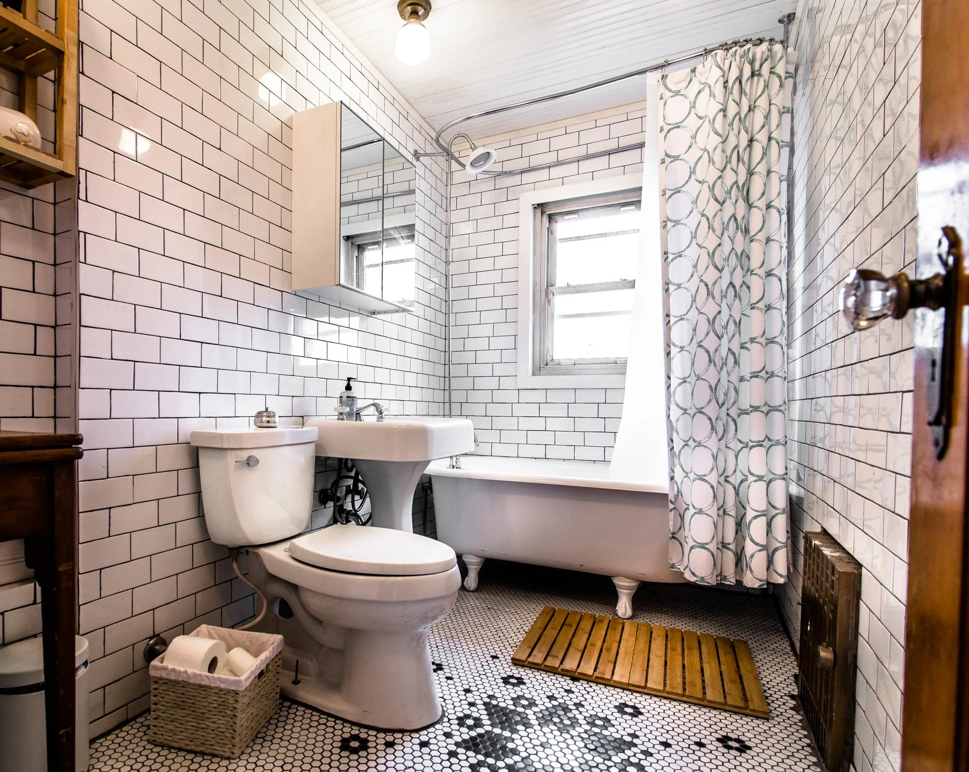
I was operating on the instructions that tighter compositions are more graphic and interesting, which can certainly be true, but a lot of these landed in the awkward valley between. This bathroom shot had design elements on the edge of the frame that should really have more room to breath. So a wider shot that showed more of the tile design on the floor, and space around the light fixtures, would have been preferable. The tile work, in particular, deserves its own close up image. If I shot this photo today, it would be a wider shot at a 3/4 view, panned a little more to the left to show more of the room. A tighter shot of someone enjoying a bath in the tub could also be a nice addition to the set.


These two images also suffer from being a bit too tight. The beams on the ceiling are among the most interesting aspects of this room, and shooting a wider shot where they sprawl out would have had more impact.

Here’s a shot that’s got too much going on. Your eye is pulled all over trying to look at the different elements in frame. A better setup would be a shot that focuses just on this table, the artwork and sconce, then a seperate shots for the staircase, and another for the opening into the dining room.

This is a photo of a refrigerator.
Maybe great for a fridge manufacturer, but not for showing off the design of the space.
A portrait orientation image of the service cart, hanging baskets, and the live edge shelves above would have showcased the design intent much better.

This is a cautionary tale on sticking too closely to advice you receive. “Shoot tighter” and “focus on one-point-perspectives” are both great pieces of advice, but they’re not the ideal advice for every image. A wider shot with more breathing room would have likely been better here, or an image at another angle. There’s a shot from the dining room just behind the camera here that could have used the doorway to frame the kitchen well, but failed by adding too much into that frame, too.

Here we have little hints of things all around the frame: table in the foreground, cut off vase of flowers, media console barely in frame on the right, an amp with the bottom cut off on the left, no breathing room to the left of the eagles, and a view into the kitchen that shows very little aside from the logo in the kitchen floor.

I call this one “Tilt-Shift Overkill”
You know how you get a few thing, and you’re really excited to play with and experiment with that thing? Well, sometimes that exploration involves pushing that thing to the very limits of what it’s capable of just so you can learn it. But the thing is, you should almost never ACTUALLY push these things to the extreme. You just might need to do it to learn.
So, that to say, here’s an example of living the camera way, way too high and shifting the lens way, way down to make this compositon. It does effectively let you see over the table into the room beyond, but is that really the objective?
What it accomplishes best is making you feel like you’re looking down into this room while standing on a ladder. Are you up there replacing a lightbulb or something? What are you doing up there? Not appreciating the beauty of the room, that’s for sure. Get down. Lower that camera ya nut.

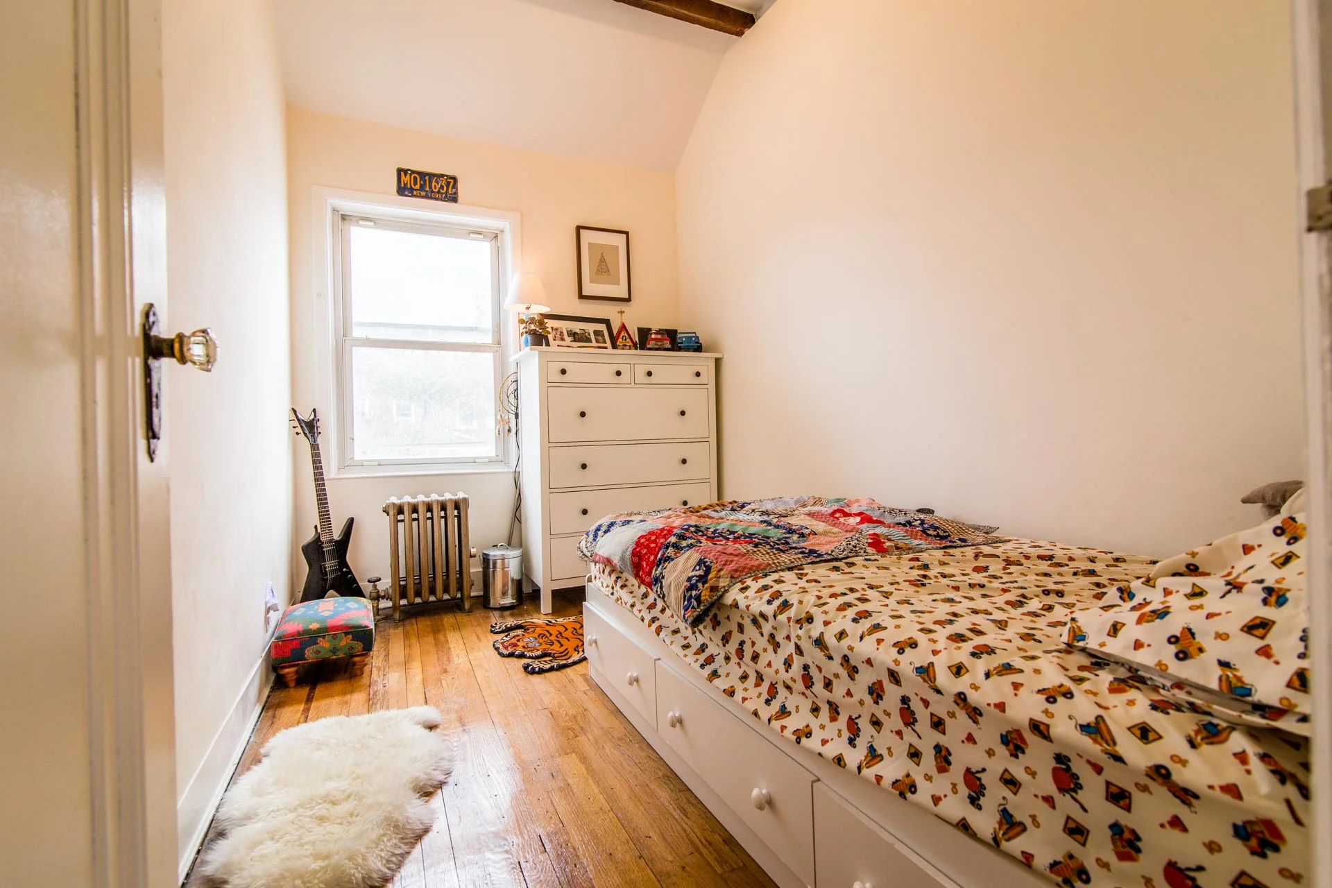
See all that expanse of empty white wall on the left? That’s called negative space. some negative space is a good thing. Too much and an image starts to feel inbalanced, as this one does. All the color and shapes are off to the right, blank emptiness on the left. And again, as with the other bedrooms, we’ve got beams on the ceiling barely peeking into the frame.